Creating Interactive Data Visualizations with Tableau
Tableau promises an easy to use intuitive data visualization experience for the end user. As this is my first time opening up the program and attempting to use the software, I think my experience will serve as a good example of how accessible the program can be to a novice. I will be attempting to use Tableau to visualize data on colleges. The data includes their location within the United States, date of establishment, and religious sponsorship affiliation.
While I have never used Tableau before, I am not coming into this experiment completely blind. I have viewed the tutorial “A Beginner’s Guide to Maps” by Ashwin Kumar from Tableau. The tutorial helps guide you through three different methods of showcasing data across a variety of map types both custom and standard as well as geo-coding the data.
While the tutorial is almost an hour long, it does a good job of walking you through the basics and showcasing the ease of use for Tableau. Because of how well Mr. Kumar presented the material, I fell into the classic novice pitfall. After I finished watching it I thought to myself “That’s so easy! I am going to master this on my first attempt.” I did not.
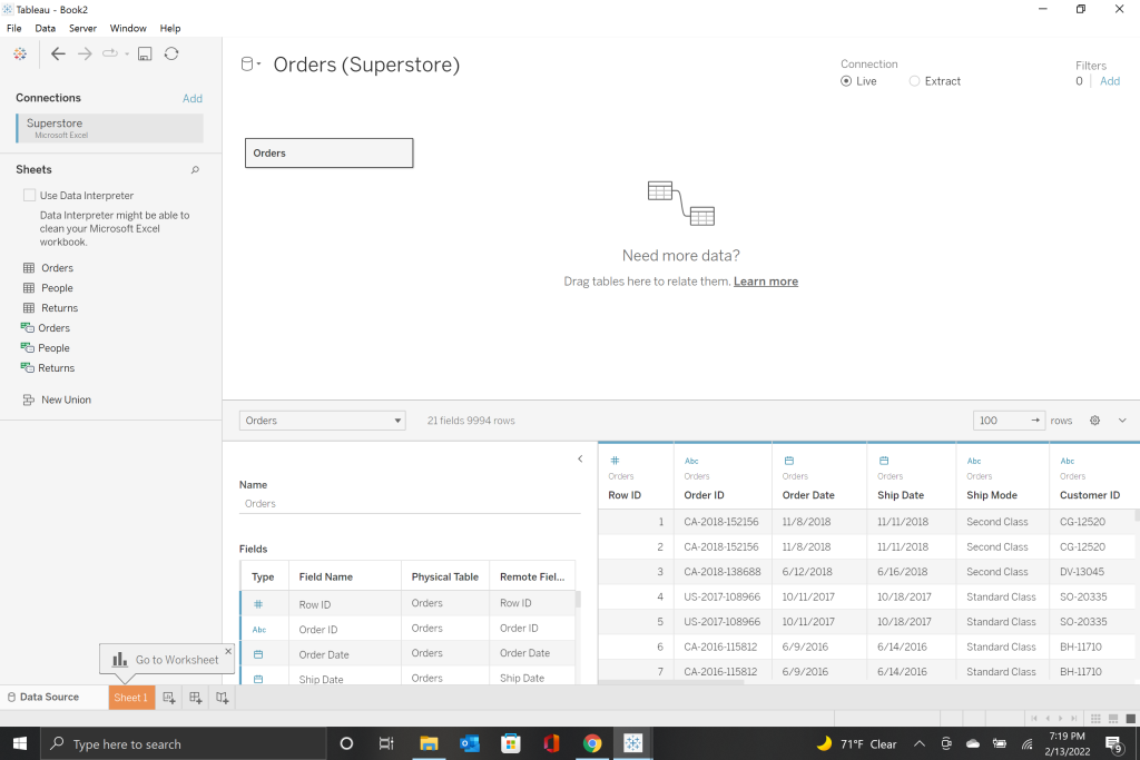
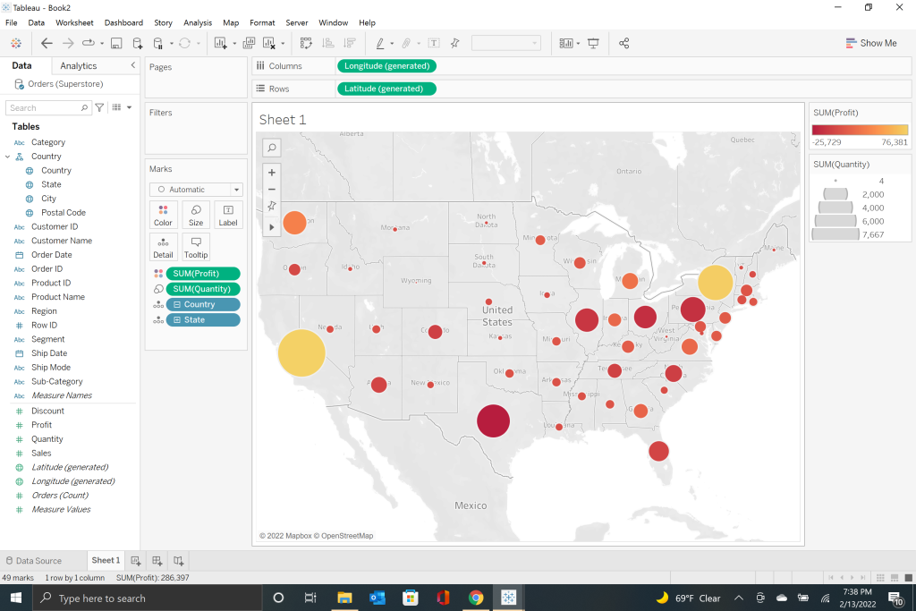
The first thing the tutorial has you do is to create a new Tableau book by importing your data. Tableau can use a variety of sources to pull data from including excel, pdf’s, text files, and many more. The data set I began with was in the form of an excel spreadsheet. Once you import the data set you can then choose to pull parts or all of the information from your source. To begin I have just pulled the ‘orders’ data set as you can see below.
After learning how to import your data, the tutorial leads you through the creation of a simple map. The key word is ‘simple’ as the tutorial progressed you began to realize the potential of this program to create highly intricate and interactive maps with a variety of textures and layers. From a simple black and white map to a highly detailed street view, Tableau can do it.
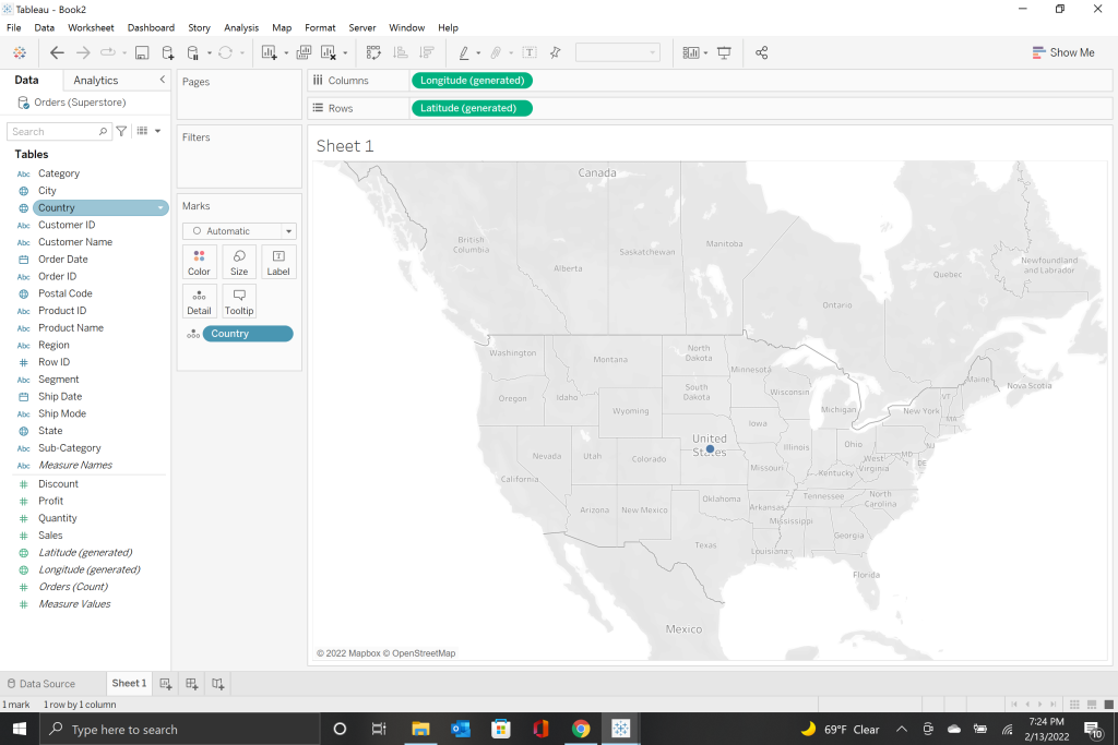
To create the simple map I was starting with however, was very easy. All I needed to do was drag and drop the ‘country’ table into the center of the blank sheet. From there the tutorial showed how you could add detail to the map all the way down to the post code level by dragging and dropping items from the ‘tables’ menu over to the ‘details’ tab in the ‘marks’ section. This section also taught me how to create a hierarchy for visualization so that the end user can click through the level of detail they want on the map.
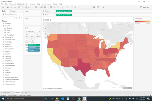
The next section began to introduce the concept of data visualization. We dragged and dropped the ‘profit’ data set onto the ‘label’ section. Once we had labeled the profit’s, they appeared on the map over the state that they belonged to. That wasn’t very intuitive to look at though, so the tutorial walked us through using color as a visual marker. By dragging profits to the ‘color’ section, I was able to create a color scale of profit from least to greatest. Because I thought that gold was a good representation of profit, I chose to make my map shift from red to gold.
The section also walked us through making corrections and changes to the data set from Tableau. You do not need to exit the program to make corrections to your data. The set I was using had misspelled ‘Delaware’ and to fix it all you need to do is click on the bubble at the bottom of the map labeled ‘# unknown’ and make the correction.
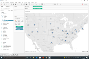
The final part to this section had me visualize the quantity of sales through the size of circles on the map. Just like everything else in Tableau, that started by dragging the thing you want to visualize to the label of how you want to visualize it. Once we had placed the ‘quantity’ onto the ‘size’ label the circles appeared. I played with the size of the circles a bit from the dropdown menu to make it easier to see.
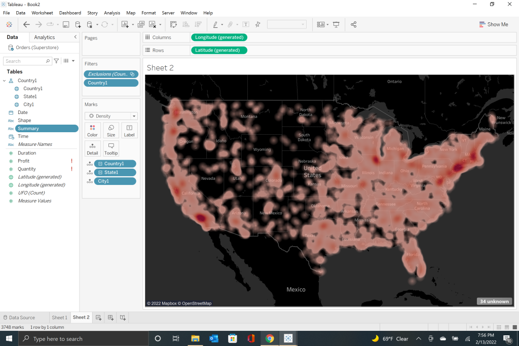
Part II of the tutorial explained more advanced concepts such as customizing how the map looked, density displays as well as how to keep the map from zooming in and out to keep track of the data being displayed. The dataset we used for this section was ‘UFO sightings,’ fun!
One of the more useful features in this section was in learning how to change the map type. In order to do that all you have to do is go to the ‘map’ section in the top toolbar and make your selection. For this section of the tutorial I changed the color of my density mapping to red as I thought it could represent Martians and the tutorial had already beaten me to the punch by using green.
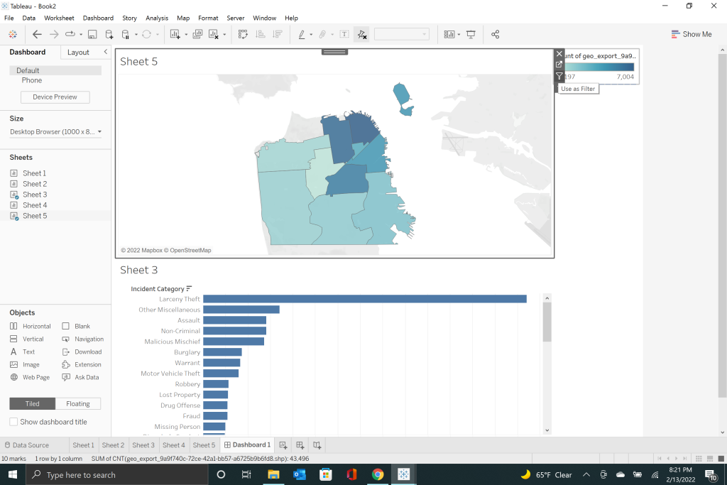
Part III takes the skills we learned in I and II and turns everything up a notch. In this section we were looking at the crime in San Francisco. This section showed how, using the map layers function in the toolbar, you can create as much or as little detail as you would like to best visualize your data. In addition, Tableau supports the use of user created maps that can then be imported and serve as the base layer map.
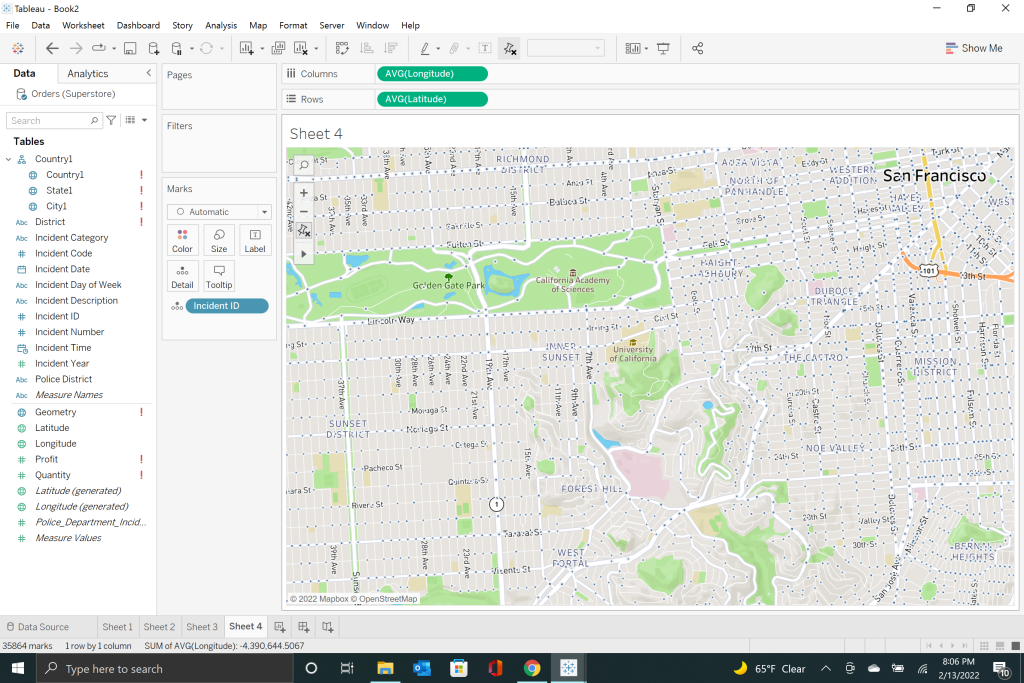
An interesting feature that I learned in this section was Tableau’s ability to connect data from multiple sources by using shared features. By taking the district mapping of San Francisco and the police districts, the tutorial demonstrated how you could inter-connect the datasets.
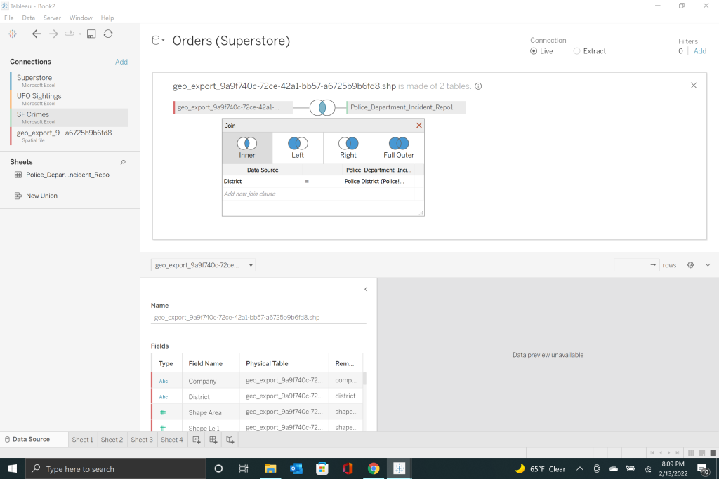
We then learned how to use Tableau to create an interactive dashboard that could display the type of crime and the frequency for each district as you click on it. In order to do this, all you need is to drag and drop the worksheets you want to use into a new dashboard. From there, you can click on your map to ‘use as filter’ and the graph you dropped into the dashboard will start to use the highlightable map to function.
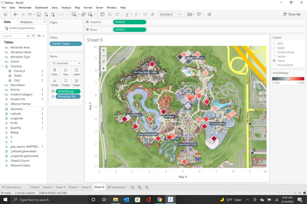
Part IV was the culmination of everything we had learned up to that point. From the creation and utilization of a custom map to an interactive dashboard with user controlled data visualization, this one had it all. The data set we were working with was a list of Disneyland rides and enjoyment surveys of those rides across 4 different age groups. The goal was to create a filter that would rank the rides from least enjoyable to most for each of the groups. In order to achieve that goal, you need to go to the drop down menu of the ‘filters’ list and select ‘single value list.’ That would allow the filters for the data to only show one group at a time.
With the tutorial completed it was time to move on to the project itself. If you remember from the beginning of this post, the project I had been assigned was the visualization of college data and religious sponsorship. After viewing the tutorial I decided that the best way to show the data was with a single value filter list similar to the Disneyland list I created in part IV. I also changed the base map layer to something that was a little more visually appealing while making the date of establishment for the colleges appear in the information when you hover over their corresponding dot.
My experience using Tableau has been incredibly positive. Like anything new, there is a learning curve that must be overcome before things start to feel natural. From this limited experience I feel confident enough that I understand the basics of Tableau and I can begin to use it in other applications. Am I a Tableau wizard? No. But the program delivers what it promised, to create an intuitive, user friendly software that can create amazing interactive data sets. Overall, I am very impressed with both the tutorial and the program itself.