Kepler and Carto: Mapping Datasets
This week I learned how to map datasets with both Carto and Kepler.gl. Both of these mapping tools allow digital historians to create interactive and impressive maps with datasets collected from historical research. The benefit to each of these programs is their relative ease of use and intuitive map making. While I enjoyed making maps in Tableau, both Carto and Kepler.gl seem to work better when embedded in WordPress than Tableau did.
I will begin with Kepler.gl. This is the tutorial I used to learn the program. It was created by Dr. Stephen Robertson and used in his digital history class to teach students about Kepler. The tutorial was very simple to follow and provided clear instruction on each step. The dataset I used for this tutorial was from the Library of Congress’ WPA Slave Narrative Collection.
The first step I needed to do was to download the dataset and then upload it into Kepler. This process was as simple as it sounds and quickly integrated the data into a point map.
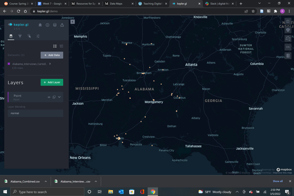
From the layers menu, it is very easy to play around with the color, size, and opacity of the points on your map to make them both visually appealing and accessible to your intended audience. The tutorial also showed me how to use the tooltip menu to add or delete information from the points to make the map more legible when the cursor is placed over a specific point.
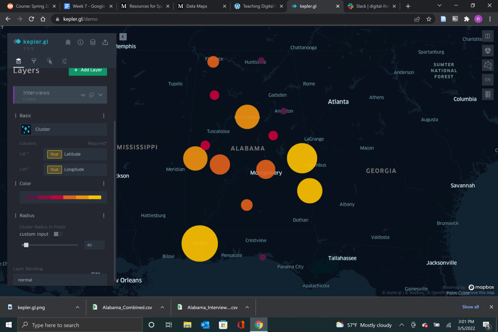
From the layer menu you are also able to change how the data is presented. You can select between a variety of different presentation styles from points, to a heatmap, cluster map, density map, and multiple comparison tools.
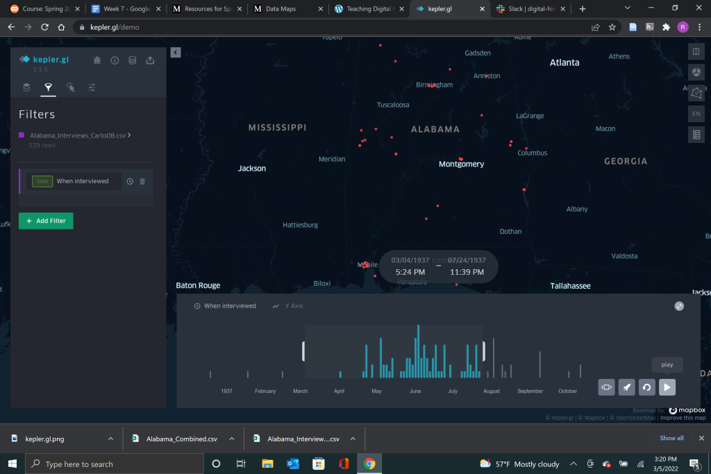
My personal favorite from the tutorial was the timeline point map. This map allowed me to see when the interviews were collected and how many were collected within a set timeframe. As the map played forward in time, the interviews appeared and disappeared in sync. Kepler creates the timespan for the map automatically from your dataset and all you need to do to create the timeline map is set the filter to the date the interviews took place. This map creates an interactive moving map that draws the eye in and creates interest in the data presented while also being a useful tool for interpretation.
The second tutorial I followed this week was a demonstration of the program Carto. This tutorial was created by Lincoln Mullen and was not as helpful as the Kepler.gl tutorial by Dr. Robertson. The Lincoln Mullen tutorial mostly encouraged me to play with the system myself and try to find out if I could get the results the tutorial asked for. Although I did not think the tutorial was very good, Carto proved its ease because I was able to display the practice data quickly and easily. The data set I was using for this tutorial can be found here and were the locations in Amsterdam depicted in art between 1550 and 1750.
Carto and Kepler are very similar in the way that the mapping software interacts with data. Once I had downloaded my data source and uploaded it again to Carto, the program took over the mapping and immediately placed points on the map.
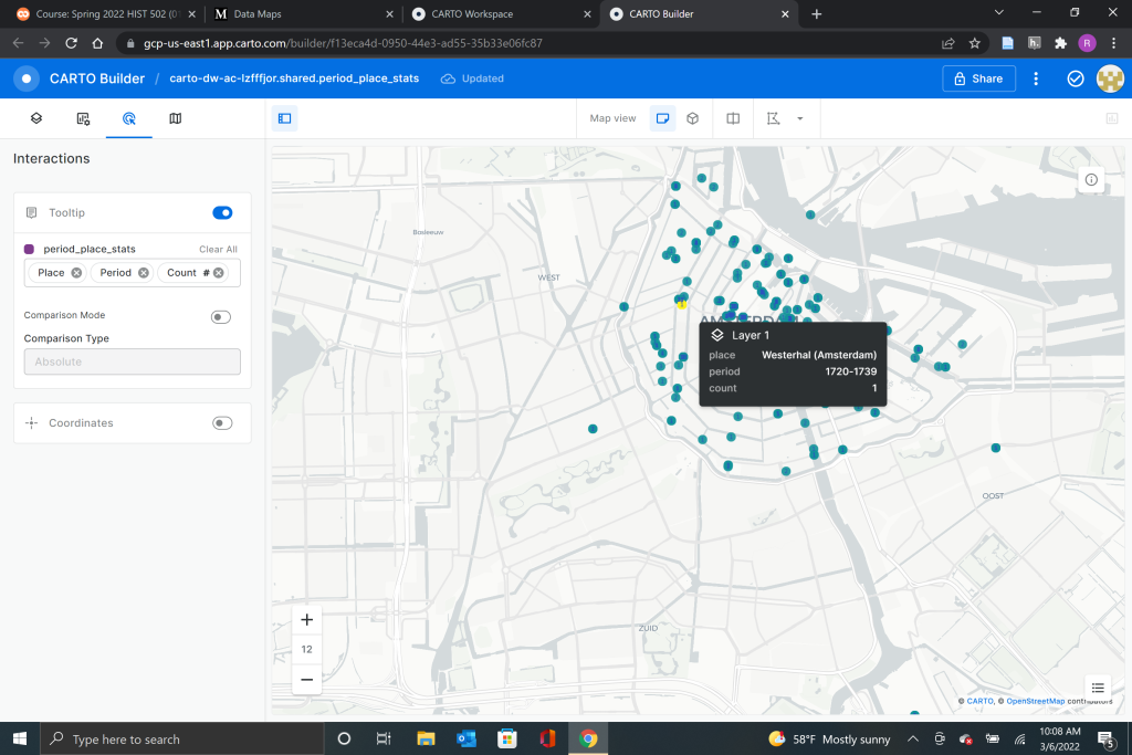
Just like Kepler, the points in Carto can be edited and modified to display different information as well as selecting the font and color that works best for your mapping needs. While the tutorial for Carto might have been light on actual instruction, it served as a good thought experiment about how data is acquired and displayed by digital historians as well as how displaying the data in different ways can change how it is perceived. This is an important part of digital history and is often overlooked by more traditional historians who do not often work with digital mediums to display data.
With both tutorials complete it was time for my to attempt a data visualization of my own. Since my thesis idea revolves around tribal economics, water rights, and federal assistance to Native American tribes I decided to create a data set showing the number of Kumeyaay tribes in Southern California who currently have adequate infrastructure. The data I gathered was from the State of California USDA Rural Housing Development, personal correspondence with tribal leadership, and HUD information on tribal colonias which I found through this article. I also attempted to use batch-geocoding of spatial data through Mapquest, but I quickly found that Mapquest was not able to compute accurate latitude and longitude coordinates for Kumeyaay reservations. The coordinates that Mapquest spit out placed the 14 federally recognized Kumeyaay tribes across all of the lower half of the United States rather than just in Southern California. This very well could have been user error, but after that disastrous experience I decided to use google maps and look up the latitude and longitude for each reservation. This method would have been impractical for any large amount of data and is not something I would recommend, however, because I only needed to locate 14 points in this case it worked.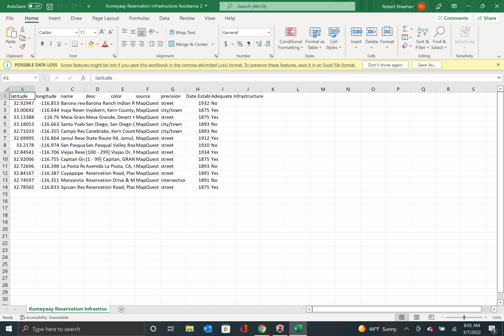
Once I had my dataset created I was able to upload it into carto and have my points displayed correctly on the map. I edited the tooltips to display the date the reservation was established and I also display the if each reservation contains adequate infrastructure to support its population. My criteria for the level of adequate infrastructure was a lack of government assistance through grants and no “colonia” designation. You can find the finished map below.