More Mapping with QGIS
This week I used tutorials by Fred Gibbs to learn how to use the geographic information system QGIS. QGIS is a free program that has huge potential but a steep learning curve. The tutorials I used can be found on archive.org as the screenshots are not displaying properly on Gibbs’ own webpage. Here are the three tutorials I used part 1, part 2, and part 3. These tutorials are enough to get the general idea of how useful QGIS can be as well as how difficult it can be to master the program. I can confidently say that after completing the tutorials, I will need to reference back to them if I need to use QGIS for anything.
When you open QGIS for the first time you will be confronted with a blank canvas and many different icons for tools that you have probably never heard of. With my limited experience on other GIS systems I was expecting to have a world map automatically generated once the program was opened so the blank canvas was a surprise, but also a hint about how the program would work. QGIS needs everything to be spelled out to it. The program is immensely powerful but it is limited by the proficiency level of the user more than other comparable programs. Gibbs wrote in the tutorial that even basic functions will need to be spelled out for the program to work in the way the user wants it to.
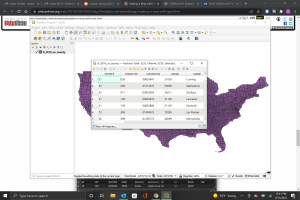
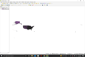
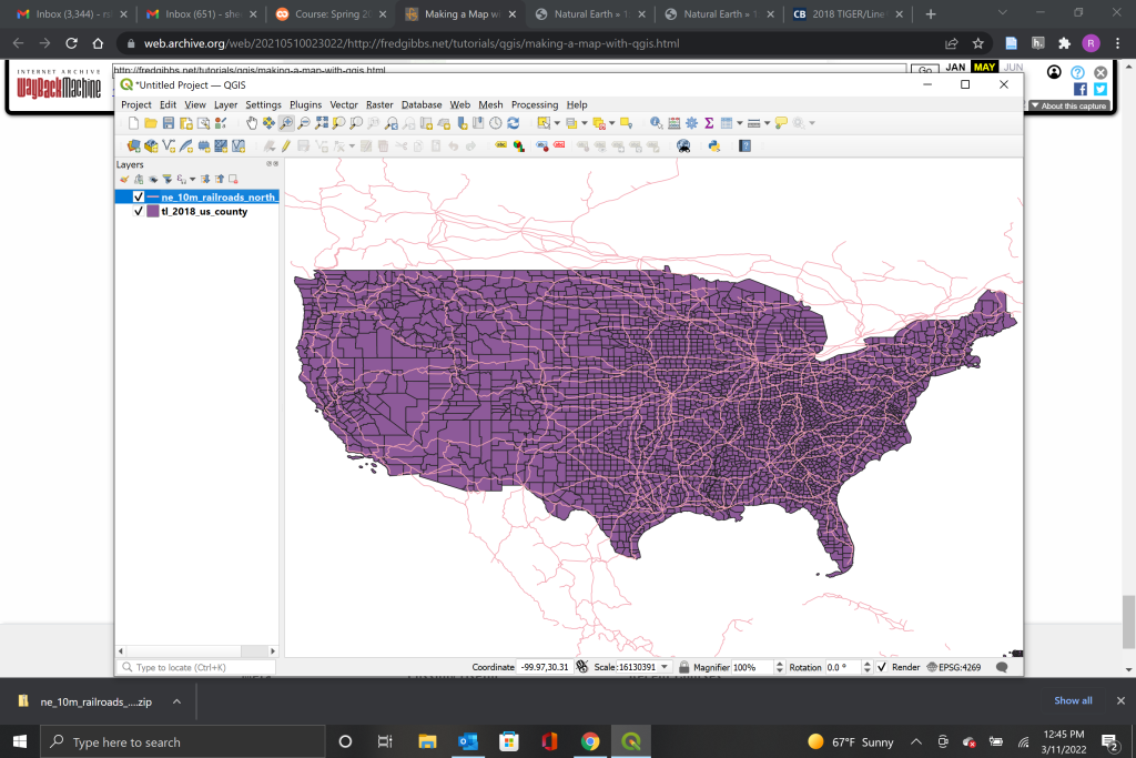
The first tutorial worked on importing data from the U.S. census to create a map in QGIS. Once the data was downloaded and unzipped, it could then be imported into QGIS as a vector map. The map displayed the United States and its territories in their correct geographic positions if you were to imagine the canvas as a paper map. Since the tutorial was only interested in the contiguous 48 states, I zoomed into the continental United States only.
The next half of the tutorial had me adding in an additional layer of railway data to place onto our newly created map. The data for the railway came from Natural Earth Data which is a great resource and has a collection of various data sets for different places and utilities. Adding the railroad data was the exact same process as the data for the map of the U.S. QGIS automatically overlaid the railroad systems once the data was imported.
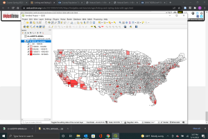
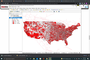
The second tutorial expanded on the map I made in the first by adding additional layers of complexity. I started by first adding in population data from the U.S. Census for each of the counties displayed on the current map. The next step was to join the population data set with the county data set by linking them through the join layer field. Once QGIS was associating the population sizes with county areas, I began to play with the color pallet to make it more visually appealing. After I had selected a color I liked to display the tutorial walked me through how I could display the data from “single symbol” to “gradient.” You can see the difference that made in the screenshots below
The third and final tutorial added additional cosmetic layers to the map we had created in order to make it more visually appealing. This included the use of an historic map as well as a geographic texture map. I got my historic map from the David Rumsey Map Collection which has many historic maps that are often copyright free. The map I am using as suggested by the tutorial is an 1860s railway map of the United States. To overlay the map I got from the Rumsey Collection we need to project the features onto the county map. In order to do that, I went into the QGIS georeferencer and selected matching geographic points on both maps. Once that is done you can save the georeferenced image and upload it like any other layer. The georeferenced map will follow the marked points that you selected. The more accurate points you label, the closer each of the maps will line up.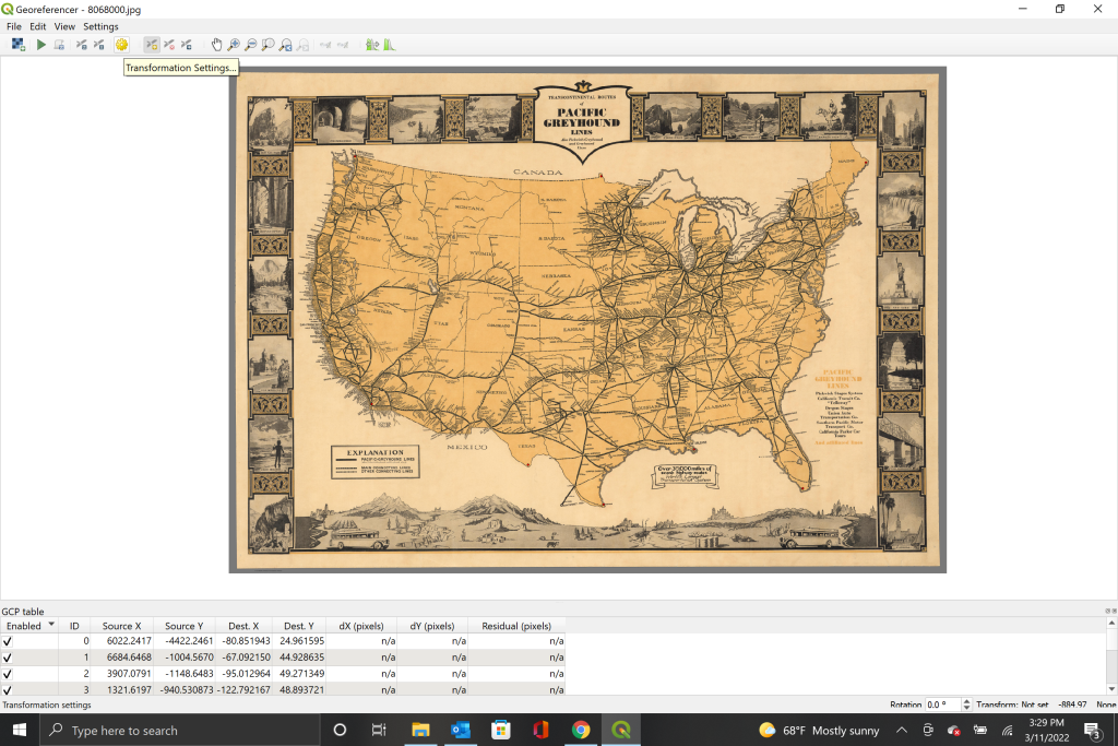
The last thing I added to the map was a terrain map. This was loaded in as a raster image layer from Natural Earth.
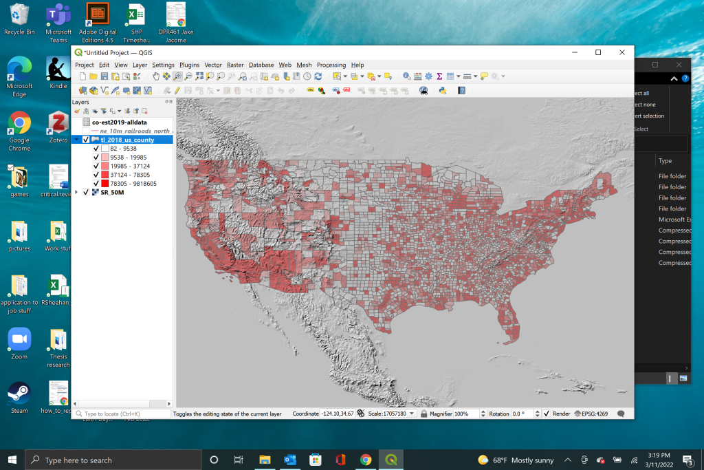
In order to have everything fit together well the tutorial had me tweak the opacities and colors of the layers until everything was legible and clear. This took the longest for me as I spent a while playing with opacity settings and the order of the map layers to get a final map I was happy with. It is still not the cleanest looking map but it gets the message across.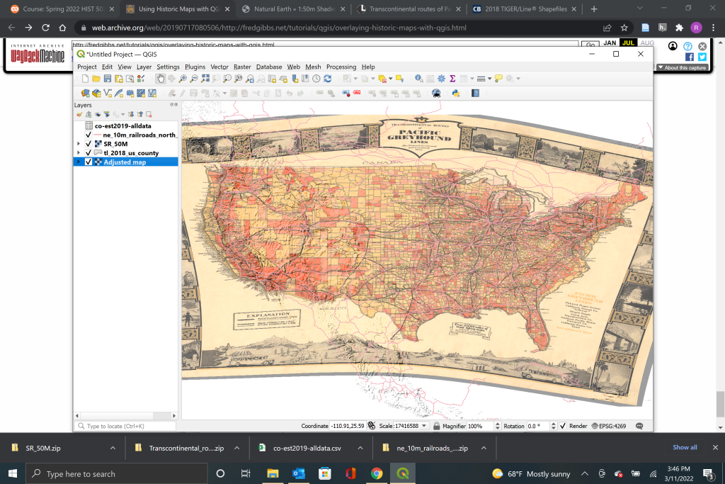
While QGIS was sometimes confusing and difficult to work with, I can appreciate the power of this program to create data visualizations. I could see myself using QGIS in the future to create maps and display data in projects. I’ll just keep the tutorials handy so that when I want to jump back into QGIS I can get a refresher on how it all works!