Using Text Analysis to Unlock Hidden Trends
Using text analysis programs can be a huge help to digital historians. Using programs to track the frequency that specific words are used can help a historian track trends that otherwise might not immediately jump off the page. Text analysis programs can be especially helpful when attempting to analyze large a large corpus or series of works as the program will take minutes to compute the data significantly reducing the workload for the historian. This week I will be jumping into the deep end of text analysis by learning how to use Mallet and Bookworm as well as creating an ArcGIS story map.
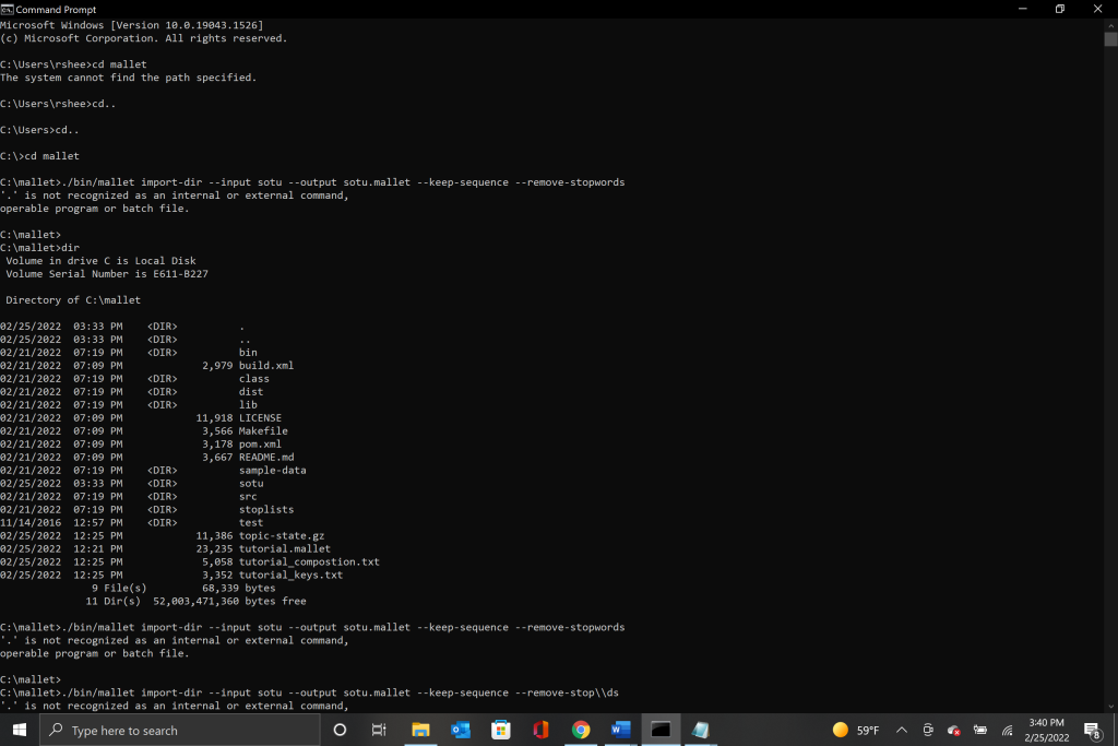
Mallet is a program that utilizes the command prompt window to run and reminds me of the early forms of computer programing. The installation of Mallet will be done using this tutorial written by Shawn Graham, Scott Weingart, and Ian Milligan. The tutorial starts out with basic instructions for how to download Mallet and get it running. The instructions differ for PC and Mac so be sure to follow along for whichever operating system you have.
As long as you follow the directions EXACTLY, the setup for Mallet was not too difficult. I had never used the command prompt to run any programs before so the steepest learning curve was navigating that foreign world. However, once you start to understand the basic commands to navigate and communicate with the program it becomes much easier to use.
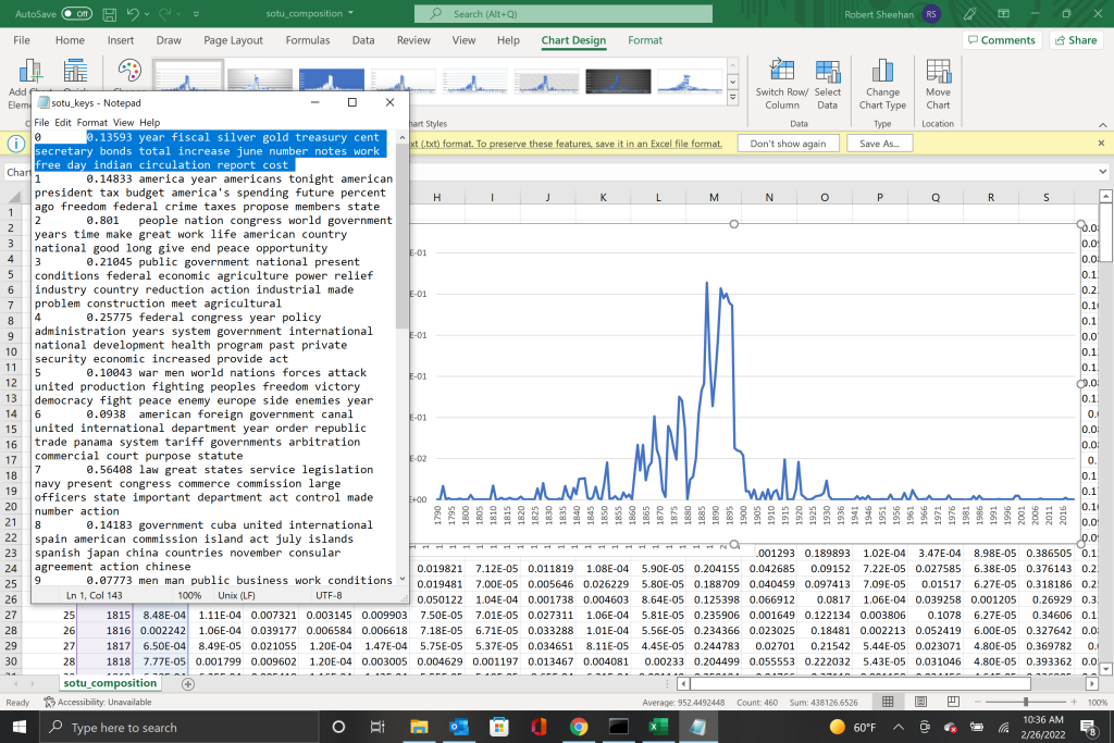
Once Mallet was installed I could move on to graphing State of the Union speeches I found in this tutorial by Jordan E. Taylor. By graphing the SOTU’s you are able to identify trending topics along a timeline. The graph allows you to see periods of increased or decrease interest in those topics and offers insight into the concerns of the American people. The graph I chose to produce focused on the topics of silver, gold, and other economic terms. The resulting graph showed a large spike in the use of those terms in SOTU’s from 1885 to the early 1900’s. I was surprised at the results as I was expecting to see a larger spike in usage closer to the 1930’s when the U.S. moved off of the gold standard. However, as you can see the terminology used was almost non-existent in the 1930’s suggesting that after the end of the gilded age in the United States, the American people were less and less concerned with that economic terminology.
Despite Mallet’s clunky operation, it is an incredibly useful tool to analyze and visualize large groups of work to determine how changes in terminology and interest shifted over time. The steep learning curve is an unfortunate side effect of how the program operates and could serve as a point of improvement for the developers.
The next program I learned to use was Bookworm. Bookworm is also a text analysis program that visualizes word trends on a global scale. The program has access to over 13 million works through the HathiTrust which enables scholars to find textual use patterns that can include works that are still protected by copyright as well as books in the public domain. The ability to track the use of words across a timeline can significantly help scholars who are looking to show cultural trends or compare word usage by region. The downside to Bookworm is that you are only able to compare or track single word usages.
For my experimentation I decided to track the usage of the term ‘Indian’ in American publications versus Canadian publication. Both the United States and Canada have published numerous books studying the Indigenous populations in their respective countries and by comparing the outdated term ‘Indian’ I hoped to see a general trend downwards on both graphs. To my surprise that was not the case.
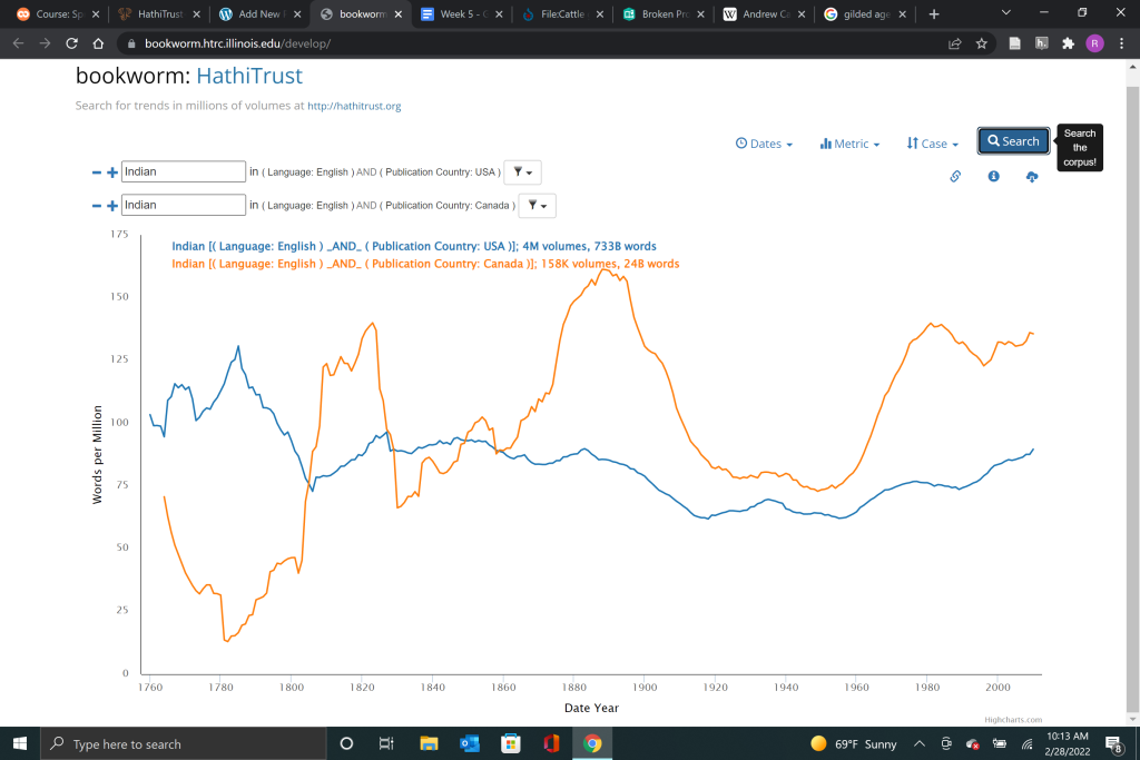
As you can see the United States started out far ahead of Canada in its usage of the term Indian in text before being overtaken in 1805. Since then Canada has outstripped the United States and neither country has seen a significant drop in usage through the present day. While I had hoped that the trend would show a downward turn after the 1990’s that is obviously not the case.
While Bookworm might be used in a similar way to Mallet I believe that it falls short of Mallets capabilities. However, Bookworm makes up for its deficiencies with a larger, easily accessible corpus and more user friendly controls. Bookworm presents an inviting interface that is easy to use and intuitive while also creating comparisons and tracking word trends that can be useful to digital historians.
The final project for this week was the creation of an ArcGIS story map. ArcGIS story maps like the name implies is an easy to use tool that can be used to create story maps. ArcGIS provide users with a tutorial directly from the website itself. It is easy to follow and gives the user a basic rundown on how everything in ArcGIS works. I have already had some experience with ArcGIS in my undergraduate studies so the tutorial was a nice refresher to ease me back into story mapping. In the tutorial I did learn how to create maps in ArcGIS which I had never done before. Because my topic covered the unratified treaty of Santa Ysabel in 1852, the mapping component to ArcGIS allowed me to visualize the territory that was taken from the Kumeyaay in the mid to late 19th century.
ArcGIS’s story mapping system is very easy to use and includes features like a content attribution section that allows the easy citation of sources that a historian used. It also creates a seamless and accessible visualization for an audience with high presentation value. I would highly recommend ArcGIS as a tool for digital historians to use when presenting their information.