For this week’s blog, I will focusing on my experience in using both Kepler and Carto to create maps that could potentially pertain to my Digital History project. I will get this out of the way first off as I normally like to in my posts, but the issues I endured in linking my GitHub account to Carto was horrendous. In the end, the issue was resolved in making my own Carto account through the university that is good for up to a year. There were other minor occurrences that I ran into such as uploading my own Excel datasets onto the program that I was able to correct by tweaking around with tables/fields.
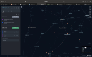
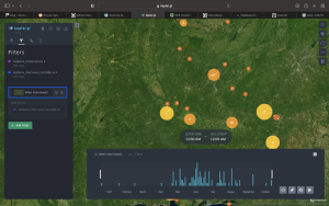
Using Kepler in following Robertson’s tutorial was actually really fun to work with when it came to the datasets that were involved (the Alabama interviews). The tutorial did show its age slightly when it came to navigating through the layers and filters which I think that the program has since changed or updated. But in following through with the tutorial, I was able to create a time, cluster, and network maps that help do better justice to the data that was compiled in creating a “spatial representation.”
While the first set of maps that I learned to create were static in their representation, the network map was dynamic is illustrating the connections that different slaves who were interviewed had with one another throughout Alabama. I will that I did experience slight confusions at first when I had to create multiple layers in using the provided datasets but there was definitely a learning curve involved.
https://lincolnmullen.com/projects/spatial-workshop/data-maps.html
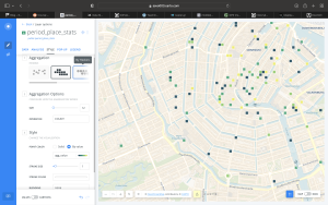
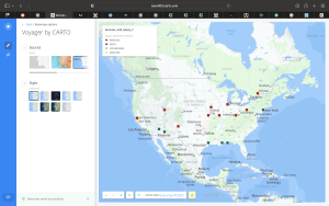
In following Mullen’s tutorial to use Carto, I found the program to be more intuitive than I initially had hoped it would be. It was really neat to create a spatial representation of Amsterdam that was able to accurately plot data points onto streets which honestly reminded me of Tableau. Mullen’s tutorial was concise and relatively short compared to others interfaces that we’ve been exposed to so far in the class however I would say that it could have brought in more information in creating legends which I found to be a helpful tool when incorporating my own dataset.
Kerouac and Kesey Dataset (my own dataset): K&K
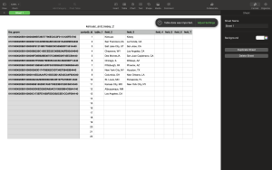
https://www.gpsvisualizer.com/geocoder/
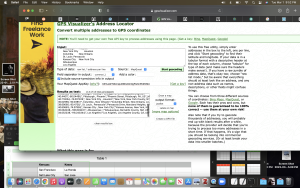
Now for using Carto I found my experience to be slightly more challenging as I had to make sure that the locations I included in my dataset were properly geocoded for the program to be able to plot them onto a map. In utilizing GPS visualizer that we got to use in last week’s session, I generated my own GPS file that I could then export into Carto as a CSV file which essentially made the process a whole easier. There were minor issues in getting the cell plots onto the map but once again all it took was a matter of tweaking and playing around with the interface to produce my end product.
Overall I would say that my experience in using Carto and Kepler were a great introduction into spatial representations that not only illustrate the strengths of data, but also potential limitations in respects to analyzing such information for users. I would have to agree here with Richard White that this is where Historians have to incorporate new strategies to build up the discipline of chronology that is so fundamental to the profession which could be supplemented through interdisciplinary initiatives with geographers and computer scientists.