Hey everyone! For this week’s assignment, we got to work with sample data sets using the interactive computer program Tableau. This program is really computer friendly and coordinated when working with datasets that you can import from Excel, spatial files etc. Before going into the mechanics of each tutorial that we had as guides for this week, I just want to say that both tutorials from Ashwin Kumar and Dr. Krivulskaya were a breeze to follow along with and yes….. I did find myself pressing the play/pause button for quite a while.

Link: https://cc.csusm.edu/pluginfile.php/3471375/mod_label/intro/Ashwin%20Kumar%20-%20A%20Beginners%20Guide%20to%20Maps.mp4
Starting off with “A Beginner’s Guide to Maps”, this tutorial was very informative with step-by-step instructions the whole way through however there were a orientation issues I found, not sure if it is because Tableau’s interface has updated since this tutorial was made.
Upon downloading the zip folder with sample datasets and images for each instructional exercise, you notice that you can import directly from Excel where the dataset is categorized by name, country, state, etc. This feature allows Tableau to be able to read the data that you are providing to therefore help you how to categorize it with ease. The first exercise uses order data from across the country.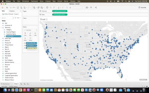
From here, Tableau then geographically plots each data point onto a map of the continental United States which you can then customize and plot according through postal code, county, and state.
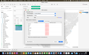
Now the neat thing with Tableau is that it detects and recognizes what would be considered as “unknowns” within your data and lets the user to be able to readdress them through its interface. Now this initial exercise was very helpful in getting the basics but it is the second dataset on UFO sightings that truly expose how you can manipulate and make the visualizations truly your own. Here is where we learn how to chart data sets through a xlsx file that is slightly different from an excel spreadsheet. 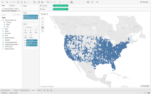
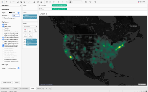
Now it is worth showing here the differences your visuals can have when you go beyond the basic functions from the previous exercise. Here I can not only change the display settings to “dark mode” but I can also manipulate the plotted data sets with what’s known as “intensity” where I can show the higher frequency of UFO sightings by brighter color clusters.
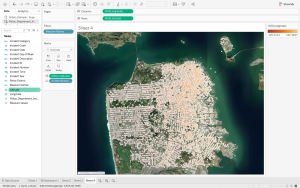
The third exercise is far more detailed and county specific as it looks at crime rates in San Francisco County, where the data is divided up by not only the type of incident/crime but also street location and date. 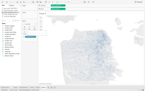
By using GIS (geographic information system mapping), Tableau is able to chart each data point along the streets where incidents where documented, to which you can then change the display to show “satellite” or “street view” where the user can more easily acclimate themselves to.
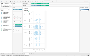
Here is where we learn not only to chart data points in map orientation but also into charts and other visual aides. Down below, it the same data set that was previously shown on a satellite image placed into a chart where it clearly that different visuals vary in their impact and application for the user observing them.
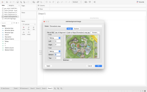
The last exercise in Kumar’s tutorial is where I ran into technical difficulty. For this exercise, we look at creating our own map that we can import as a Jpeg through the fun and joy of…….Disneyland. Yes, Disneyland. The dataset involved looks at both ride attractions, visit wait times, and frequency of attendance. I ran into trouble where I kept trying to add the park image as my background map and for some reason the image would not load but the data points would be placed in the spot where they would be found in the tutorial. I triple checked that I properly changed the column/row ranges and that the image fit the whole picture but still I was not able to resolve the issue, If any of you guys happen to come across this same issue, hit the comments below and let us know how you were able to navigate through it !
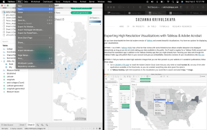
Now for Dr. Krivulskaya’s tutorial to learn how to export images out of Tableau Public. I’m not sure here if some of the steps were slightly different because I was able to get the desktop version through my student email that creates a student account for I believe a year or so.
Link: http://www.suzannakrivulskaya.com/tableau-visualizations.html
What I mean by this is that when I went to “file” and noticed that I wasn’t;t being given the same export options other than copy/paste.
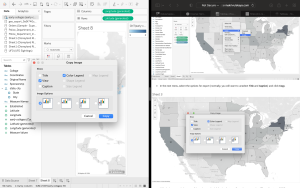
I was able to eventually get to this step using the dataset provided about early colleges that was an excel sheet. And from there, it was simply a matter of importing the image onto a platform like a Word Doc for example which worked but I used Pages (Mac) to see if it would also go through. Overall I would say that this week’s introduction to visualizations and getting to learn how to use Tableau was really informative. Disclaimer, I had a “small world” incident where my uncle who happens to work in a logistics department for a shipping company in Mexico happens to also Tableau for board presentations and he was able to offer me he own perspective on the interface which he found to be both user friendly and fun to work with!
-R.V.S