Hey everyone! So this is my review of using Datawrapper which I found incredibly user-friendly and easy to help visualize the would-be data I would use for my own research. 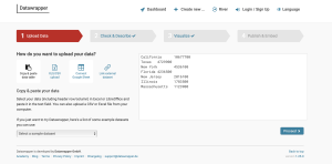
Now when using this site, clearly I do not have any data of my own even from my possible Digital Project ideas that I could have embedded so I used data provided through the tutorial. The various options to pull data from was impressive as you could draw from an excel sheet to manually copy and pasting the data yourself.
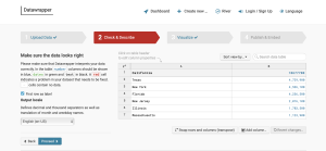
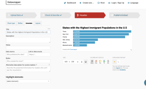
One of the neat things with Datawrapper is that it thoroughly interprets the data that you provide, making sure that no errors could possibly be made once it drafts up and offers different visualizations for your data.Lastly, choosing your table/chart is probably the most exciting part because apart from selecting a style that accurately visualizes your data, you have the aesthetically creative license to toy around with different display settings such as dark mode and “colorblind check. ”
And bam! Once you’ve done that you can provide your email to either embed or use your chart as a PNG. I think that this tool is amazingly helpful for historian’s and their projects that rely heavily on statistical data. Hopefully I can use this site for my own research!
-R.V.S