ArcGIS
PostsI used the data sets and tutorial provided in this post– link here
I really liked this set-up, perhaps more so than any of the other map-making tools we have used so far.
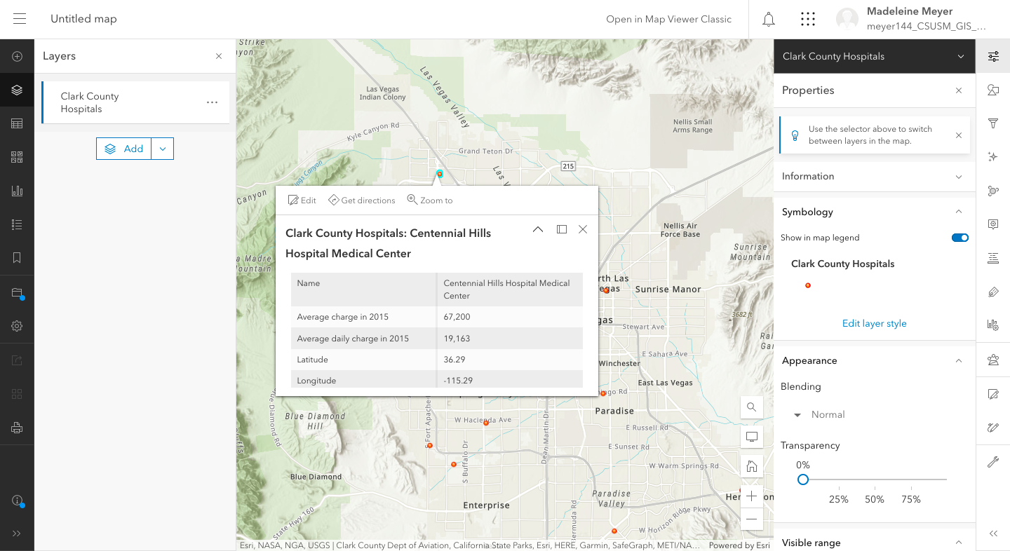
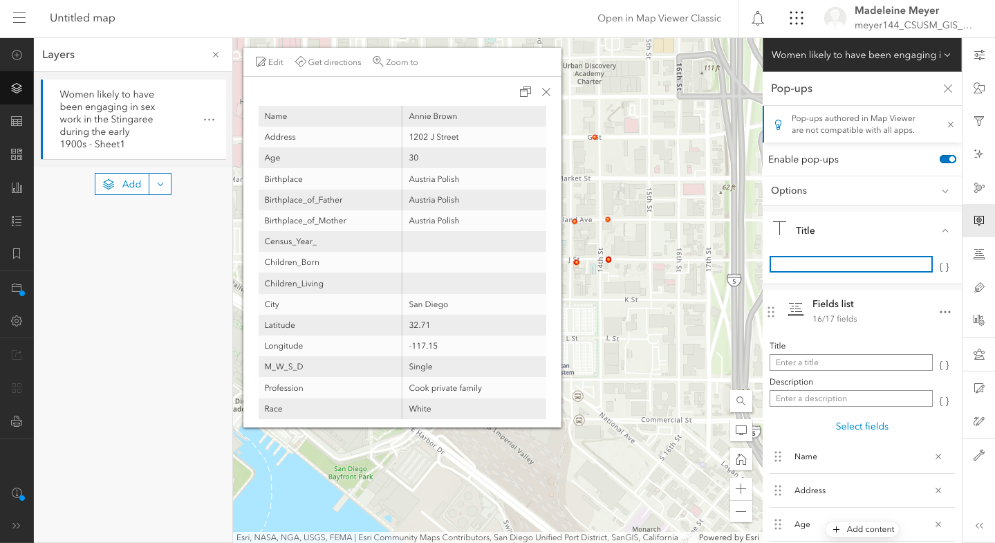
Within moments I had a comprehensive, responsive map of the data. I didn’t try configuring the pop-ups or map layer changes, as I was, once again, excited to see how it would look with my data. I got a little worried when I saw that my “type” said “string” (which it hadn’t when I had used the tutorial datasets), but figured the display mode would probably be a little different compared to the tutorials based on the categories of data I had entered.
Now I’m going to return to the tutorial, following along and playing with the “styles” available in the right hand sidebar.
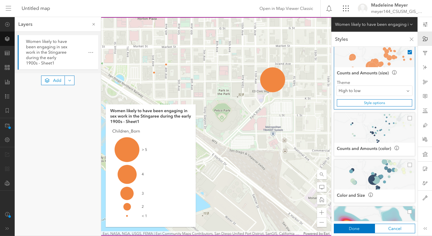
Okay… now I’m realizing that, seeing as my Excel sheet only has a few numerical values to go off of, I may be at a loss here. Also, my data is incomplete in areas and could be tidied up…
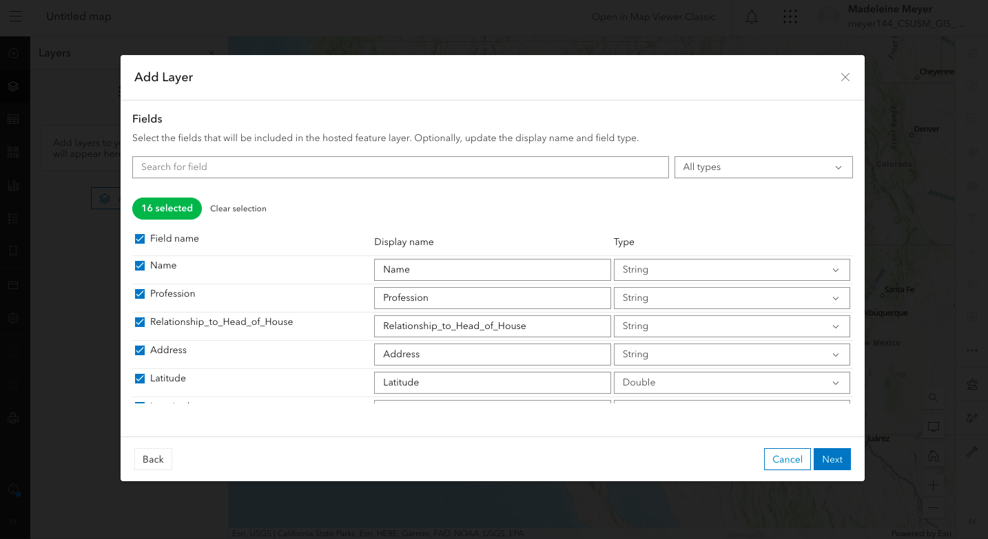
Oh, wait, no, there’s a way to fix that in the next step of the tutorial! I cleaned up the data here and took out any unnecessary labels or chart info (using the “fields list” to remove the title of the document that I uploaded and the “city” field that I was using to tell the map to focus on one part of the country.) There was a lot of clicking back and forth to the tutorial at this time, as this was probably the hardest part for me. At least the “fields” thing made sense, and after a while my brain just started replacing “fields” with “categories”.
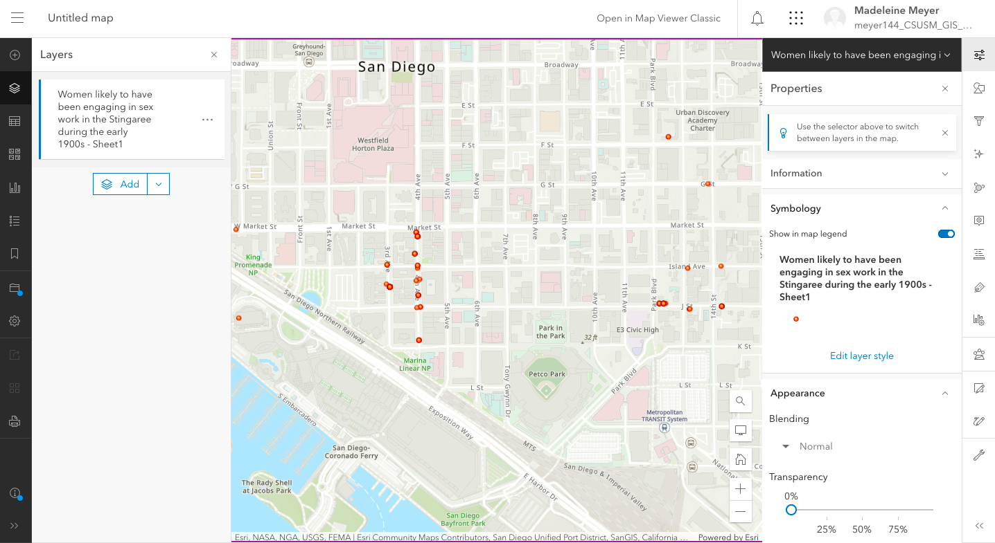
I liked that the design felt pretty intuitive over all. There was a wide variety of customizable options that made it pretty easy to make the map I wanted.
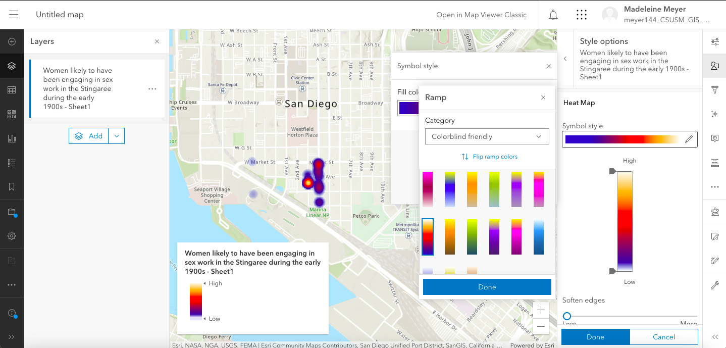
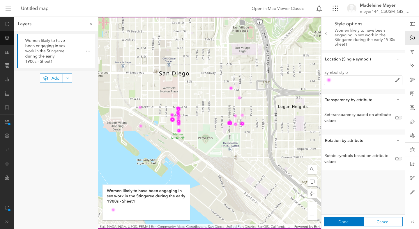
The ability to change how multi-dot spots are represented were pretty cool. Most women engaged in the sex trade were, of course, living in shared houses, making it hard to visualize their residential patters on more basic maps. I was excited to see here that you can make a heat map that, when clicked on, allows you to click through multiple records while displaying the total value at the top.
Seeing the final product shined a bit of a light on the wider picture for me. Since many of the women I have researched at a more in-depth level resided at Third and Island streets, you can see here that, in actuality, the data demonstrates that the “hot zone” was really in an alleyway behind the main street (halfway between I and J on Third streets) which I believe would be the “wildcat alley” (block of “cribs”) I’ve heard mentioned in oral history records and newspaper articles contemporary to the period (link here to the frustratingly upside-down map drawn by health inspector Walter Bellon in 1912, demonstrating the location of “cribs” as being in the center of blocks. Map is property of the SD History center.)
Now, I could not get the link to the map once I had published it. Every time I tried to view the map, it only showed me the editor view. I opened the link to the map in a private window, clicking “View in Map Viewer Classic” in the top right hand corner, and that seemed to give me a cleaner link directly to the map.
[advanced_iframe src=”https://csusm-gis-lab.maps.arcgis.com/home/webmap/viewer.html?webmap=e77fa245e52f4f62820f7ff119ba3844″ width=”100%” height=”600″]
I want to use this for my DH project and will continue to add to the Excel spreadsheet. The one thing I wish this software had was the thing that TimelineJS had (there has to be a word for it, right?) where the updating the Google Spreadsheet automatically changed the timeline, as I could see something like that being really helpful. I’ll be going back to the same the tutorial again, too, seeing as a few things (like adding the attribution) were not as intuitive as the map-making software was and required going to places in the website that made me go what? a few times.