Datawrapper
Posts[advanced_iframe src=”https://datawrapper.dwcdn.net/dCRZO/4/” width=”100%” height=”600″]
This article from Lena Groeger at ProPublica does a fantastic job of explaining the basics of creating your own graph, map, or chart with Datawrapper, so I won’t attempt to reinvent the wheel.
Through my own trial and error, I learned a few additional things in regards to the technology (and its compatibility with WordPress).
Most importantly, charts and tables require more formatting than maps and tables do.
I tried and failed multiple times. Here’s what I learned, starting off with a blank chart.
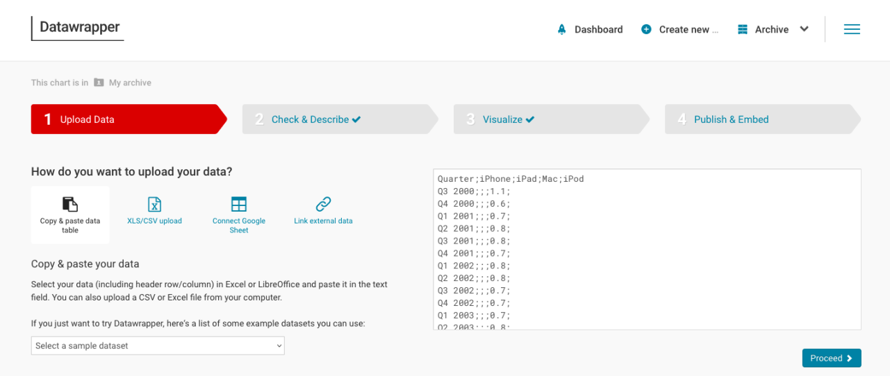
After trying to dive straight in, I quickly found out that the way I was entering my data was not working. I realized they had examples of the different formats you could use in the drop down menu (on the “Upload Data” tab), which really helped orient me.
Regardless of how you choose to organize your data (the first option on the drop down menu for examples, “Lines”, was the easiest format for me to copy with my own data set).
Here’s what “Lines” looks like in its bare format, plugged into the Copy & paste data table.
Next, we’ll plug in whatever data we would like to use
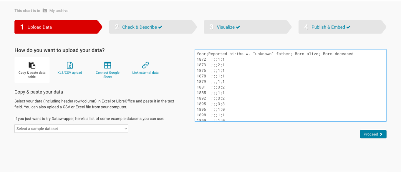
It didn’t work for me this time, either. Scrolling to the bottom of the “Line” example data I was using earlier, I realized that semicolons, when used more than once, are used to denote a blank numerical value in a chart, not to keep the labels and data separate. Oops.
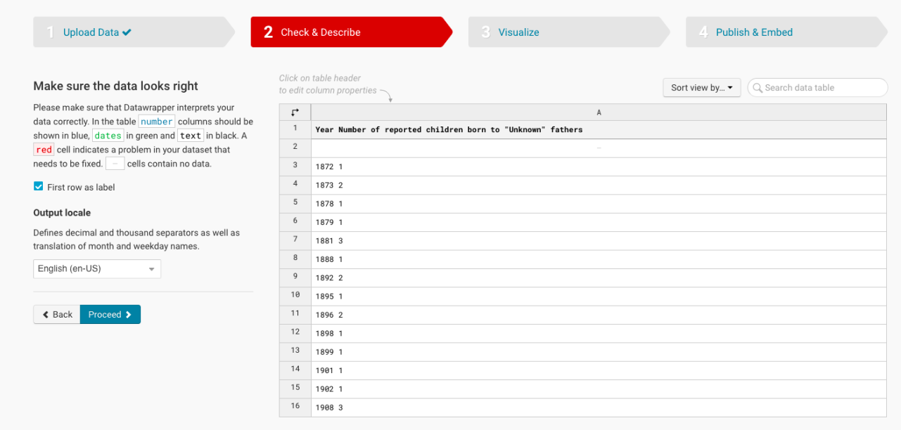
Once you’ve deleted the extra semicolons and spaces (as you can see I started to do in the screenshot above), click on “Proceed” to take you to the “Check and Describe” page, checking to see if your data is now formatted correctly, displaying blue text for numbers and green for labels.
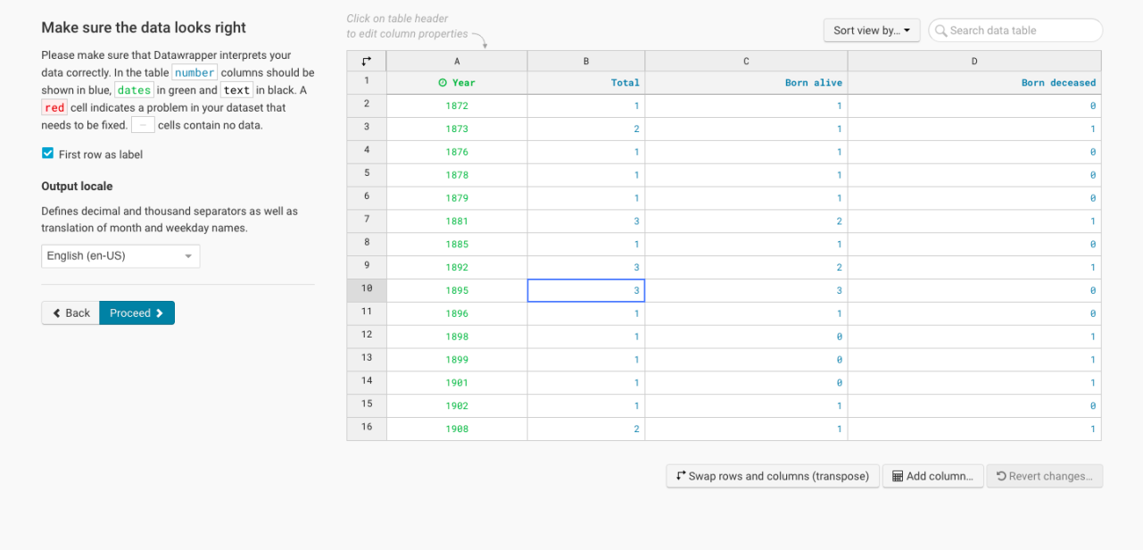
One thing that confused me was that, no matter how incorrectly I was entering the data before, I was never shown a red cell or blank mark during this second “Check and Describe” stage. The numbers displayed in black until I went back and reformatted everything.
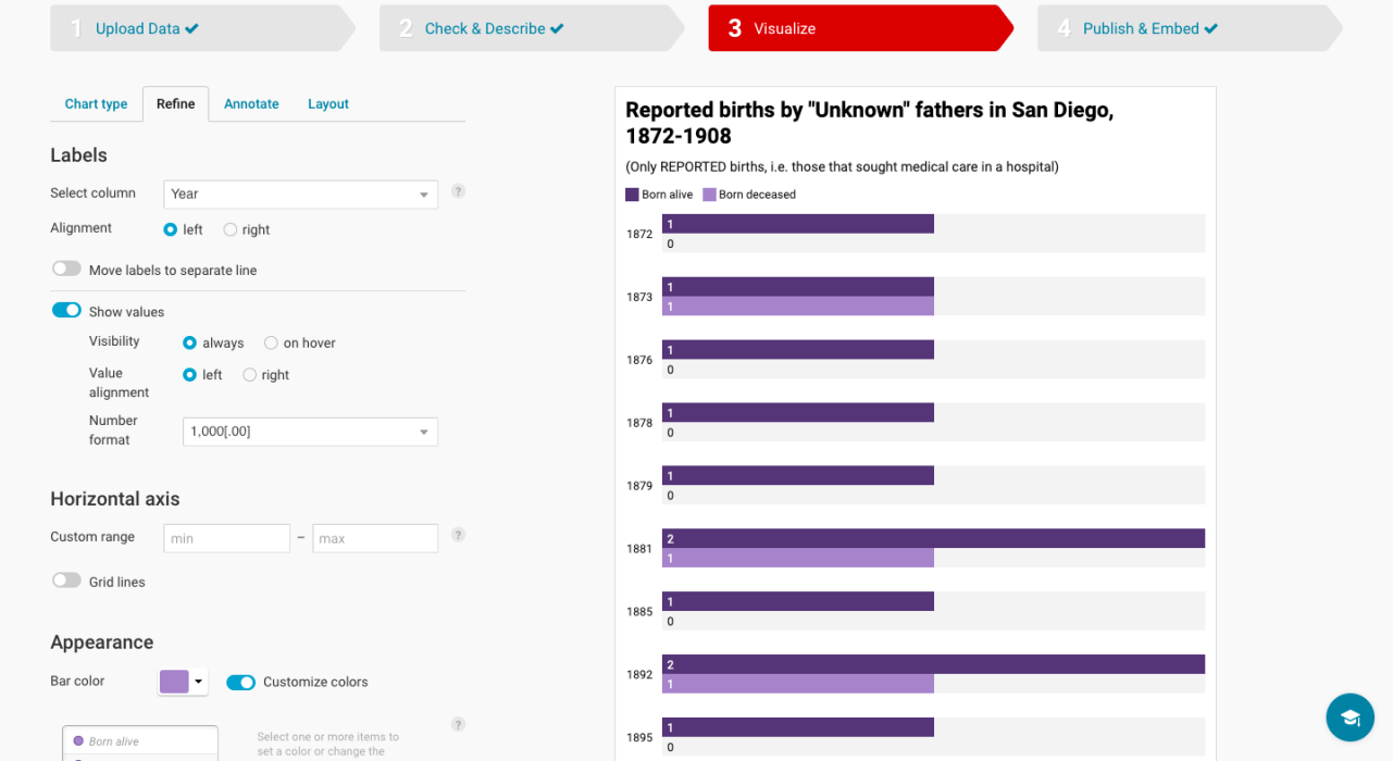
Be sure to mess around with the appearance after choosing a suitable chart type, choosing colors that help your information stand out. Depending on the data you use, different charts will fit your needs. You’re able to freely navigate back and forth between all stages of creation, so feel free to take out and add data as you see fit.
Copy the IFrame and paste it into your WordPress post on the regular editing mode, using the “Add Advanced iFrame” button to enter the formula, pasting the direct link to the chart/map/graph. (I tried to use the Elementor Plugin to format it, but once I published the page, my chart had disappeared from the css widget and the html widget)
[advanced_iframe src=”https://datawrapper.dwcdn.net/iSoFm/1/” width=”100%” height=”600″]
Once you’ve got the hang of charts, you can go to “Create New” in the right hand menu, opening a blank table. To get the hang of it, I used the same information from my chart for my table, copy and pasting the data.
[advanced_iframe src=”https://datawrapper.dwcdn.net/1Cl3R/1/” width=”100%” height=”600″]
Datawrapper was pretty useful for the free service that it is, but I would’ve liked to be able to zoom in and have a more responsive map. I played around with some of the other options, but it wasn’t good for displaying very localized events. The charts had very little explanation as to how to format them without prior knowledge of coding (is that even coding? Making graphs?)
With more time, I would have liked to play around with their options for making the content you create more accessible (color-blind friendly graphs and descriptions for those who don’t see.)
To get us through these hard times, I also recommend installing the Hello Dolly plugin. It doesn’t do anything, but it’s there, and I like it that way.