Kepler
Kepler.gl is an open-access tool that allows you to make non-interactive maps that have data inputs. The website itself is a bit finicky and has some bugs, but working with it is pretty straightforward. This map has some interesting features that can allow you to visually determine different areas on this map.
Do keep in mind that you would have to explain the information that is being presented, as it is NOT interactive. It’s just an image.
With the help of a tutorial, the website can walk you through some of the interesting tips and tricks. The visuals do look great for what the tool is worth. Depending on the browser you use, there are chances that you are going to see some bugs and errors. This is especially true for Mac users, so be mindful! The good news at least is that this tutorial is very easy to follow. There are some mild concerns with the scroll bar as well. You may or may not experience a hiccup in the tool where you cannot scroll without finessing the page a little. Don’t get frustrated, you’ll figure it out!
I utilized Kepler.gl to create a map of Segregationists in the United States as a sample. This is still a work in progress. The sit has given me some mild issues, but I believe that’s based on how I did the inputs for the .csv.
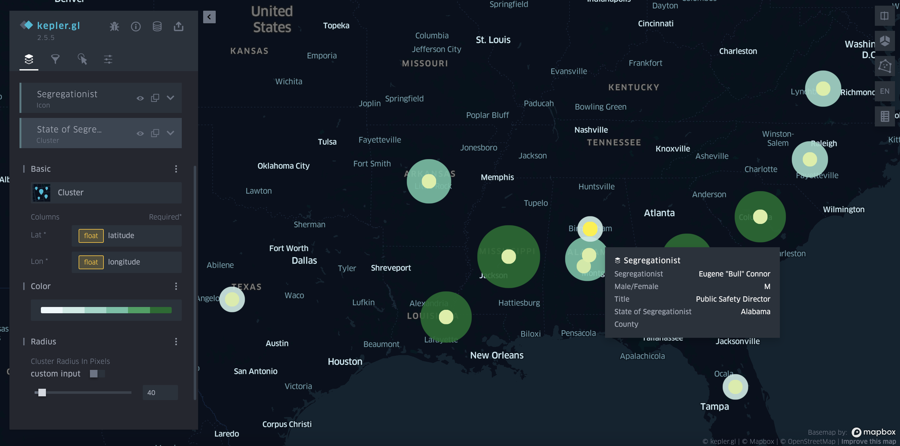
The large multicolored green circles were representations of the number of segregationists within a specific state, while the bright, more neon green colors (I honestly should have changed this to orange or any other color) represent the names of Segregationists and their occupations. I learned from this a lot of Segregationists were in positions of power to varying degrees, which was very interesting!
I think if I continue to zero in on locations within my .csv, the latitude and longitude coordinates of my overall dataset would have been more precise, thus making the map an overall change in appearance. So personally, I think having more precise data in your dataset will get you the most out of Kepler.gl.
If you would like to try out using kepler.gl, you can grab your own datasheets and take them over here!
Carto
CARTO is an online tool that allows you to organize visual data to view it with more spatial awareness. Spatial awareness utilized in geography and maps can give you the opportunity to understand information and patterns that exist over time and across locations. CARTO is allowing us to work with this visually!
Using CARTO for maps is actually easier than you might think! All you’ll need is an account if you don’t have one. If your school works with Github, you can get a student development package and download CARTO. If not, you can make your own account on CARTO independently or try the 14-day free trial!
You can choose to log in to work in the old dashboard or the new CARTO. For this review, I used the new CARTO. CARTO will take you to their Workspace page. From here you just need to click on the tab located on the left and click on maps. You’ll open a new map.
Next up add your datasheets. Make sure those datasheets are in .csv so that they work. You will click on add source from and go to import file. Upload your .csv here and then in the CARTO Data warehouse click on organization data and share. Boom! Your datasheet will show up.
From here, just play around with the layers, widgets, interactions, and base maps! Figure out what does and does not work for your map, just general trial and error.
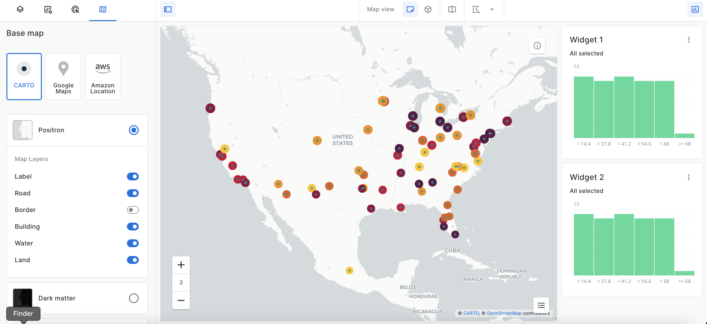
The map I created lists 68 cities with the highest rates of segregation in the United States in 2019. For this map, I only used two layers, which I added large colored points to indicate the cities with the highest rate of segregation (darker color = more segregation, lighter color = less segregation) I also added small green points to indicate where some of the cities are, as I found I had some overlapping. I also used two widgets for each of these layers. The widgets were based on the highest rates, and this is broken down into 6 different columns.
What I’ve learned from this map is that the cities with the highest rate of segregation in cities were located east, past Texas, but a larger number of these cities were located up north instead of south. There was also a single city in this highest rate located in California (Oakland). I found this interesting because a lot of history is spent discussing segregation in the South and Southeast, but we do not discuss segregation and issues that occurred in the North.
Below is the interactive map that I created. Feel free to click around and look at it. Click on the square box icon on the right to look between the different rates for the most segregated cities in the United States! Information for this data can be found here!
Overall, CARTO maps are engaging and entertaining to use, and with more practice, I can see myself utilizing this tool more for maps. If you’re interested in trying out CARTO, you can try a 14-day free trial by signing up here!