When I first opened Datawrapper, I had no clue what I was doing or how I was going to make anything interesting for the charts that we worked on. However, after going over the singular tutorial that was provided for as here, I can say with confidence that this is the only tutorial that you’ll need to develop a basic and pretty good understanding of how Datawrapper works.
First! Getting started. Following the format for the first section of the tutorial is trickier than I’d like. It left me on that opening page after getting started on how to make a chart with this
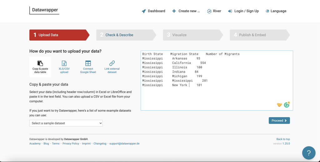
So when looking at this page, all these words are added manually. A word of advice to all, do NOT do it this way. This method is long, if you delete a single row the format will suffer. I tried it, it sucks. There are easier methods that are also listed in the tutorial. I promise you.
The best method is to click on that third column option and upload a google sheet where your work is already formatted! This is actually the easiest and saves you from having to format and cry about it. It helped me out fantastically!
Anyhow, once you’ve got all your information added, you’ll scroll down and click proceed on the next page, this will take you to step two, making sure the
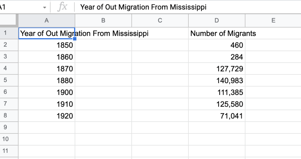
data is configured right in Datawrapper. This page allows you to make sure your columns and areas are aligned and provides instructions on how to differentiate data with color coding. I got confused here for a bit, but you just need to click on any of the column letters and look for the button that reads “Edit Column Format” and this will let you determine if it’s a text, date, or time column, as explained by the color-coding.
For the record, this is all still part of step 2. Figuring out how to actually format is going to be the most difficult thing you do. Once this step is out of the way, you’ll be on the fast track to creating and having fun!
Once we get through this part of the configuration, we move on to step three, which is making sure your chart, graph, or map is up to par!
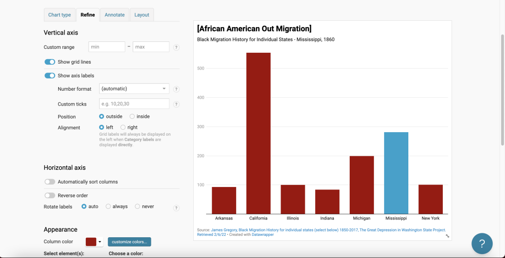
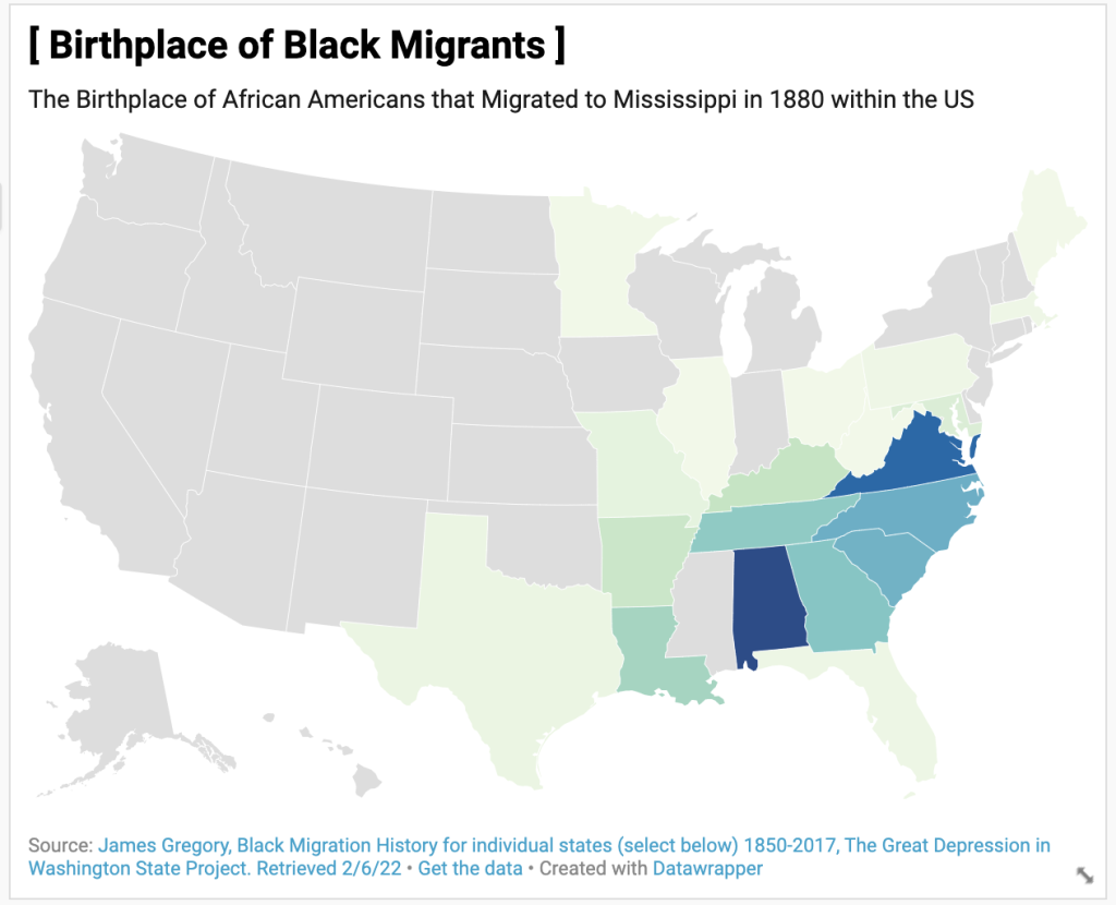
This is what my map looks like. In step 3 there are multiple parts, all of which are the 4 tabs at the top in blue words. These tabs allow you to do several things.
The first tab is chart type. Chart type just lets you pick the type of chart you want, this is separate from making maps, which you have to pick separately at the beginning of the creation process (when you click create new, you have the options to make a new chart, new map, or new table!). So this is just the visual formatting. Datawrapper gives you tons of options, like mine above!
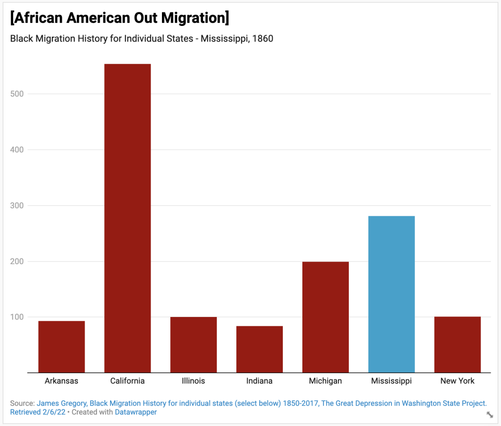
The second tab is where colors come into play. There’s a customize button that allows you to change the color of columns. I used it here to make one column blue because I wanted a visual differentiation between groups migrating and groups that were born in this area!
The third tab is the most important! And this is the annotation tab. Citing your sources is important! And this tab gives you a section where you can site the author, the title of the article or book, and who published it. You can also add links! Super neat!
I don’t really understand the purpose of the fourth tab, so you can leave that as it is and move on to the next bit!
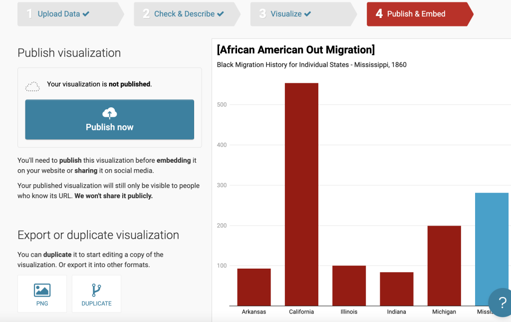 How are you going to show off your amazing visuals if you don’t publish your work? Make sure you do this! The world should see the fruits of your labor!
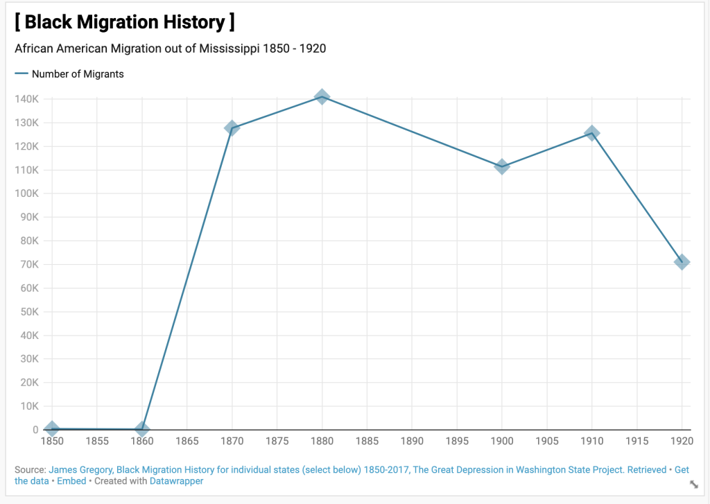
Overall, once you get a hang of the formatting, Datawrapper is a breeze! I highly recommend following the tutorial I mentioned previously, and have fun inputting your data for visual effect so you can have charts, maps, and graphs like this!
You can get started using Datawrapper Today! You can also take a look at the information on my charts on Migration!